Branding for Nonprofits07.18.17
Last week in collaboration with Maine Association of Nonprofits I presented a very interactive branding workshop to 20 great people working across the non-profit sector in Maine. This is a framework and workshop for homing in on an authentic and strategic brand platform that I’ve applied to lots of companies, but it is always fun to see how it shakes out for new organizations. This time, it was interesting in particular to think about branding in the context of the social sector and nonprofits.
Here are a couple top takeaways:
Learn How to be Two-Faced.
All organizations have multiple stakeholders for whom they need to specifically focus their message and value proposition. With nonprofits however, there is often a very sharp distinction between donor audiences and client audiences. For example the donors to Susan Curtis Foundation need to see a well run and purposeful organization with proof that they are making a quantifiable impact against generation property. Clients – youth who attend the Camp Susan Curtis – want to see a fun, cool, experience that is “for them.” Most for-profit companies do not have to deal with such a schism between the customers who are paying and the customers who are receiving the services.
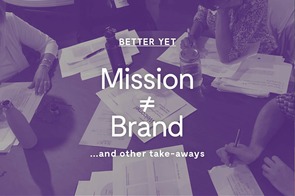
Mission Does not Equal Brand.
Most nonprofits have thought deeply about their mission, but less so about their brand. In order to get at brand, I ask the question, “How must you be perceived in order to have the maximum impact toward your mission?” One interesting example from the workshop was the Friends of the Kotzschmar Organ, whose mission is to preserve and educate about a historical and rare organ housed in Portland, ME. Through the workshop, we realized that building a brand around being slightly wacky and a one-of-a-kind experience will position the organ as a unique entertainment option for locals and tourists. Much more appealing – and poised for greater impact – than being seen an esoteric and very niche piece of musical history 😉
Aesthetics Matter.
As a designer, this is point I wish more nonprofits and their funders would take to heart. There is often a “look” of earnest naiveté to nonprofits. “Our hearts are in the right place, and our dollars are going to programming,” their materials say. There is a valid point – from a brand perspective – that nonprofits should not look too ‘fancy’ so as to communicate that they are diligently putting all their money toward their mission. However, this is a case of being penny wise and pound foolish. In today’s world where everybody is used to commercial communications with high production value, a higher level of visual polish would pay for itself in increased impact with audiences and clearer communication with funders. I’m not saying they should be Nike, but there is a middle ground to be had here.
Consider every touchpoint.
Finally I see so much untapped potential for the nonprofit world in the areas of user centered design and service design. This is an area that clearly goes beyond aesthetics, where design can make a real impact on the quality and outcomes of services delivered. We touched on some of these methods including audience personas and journey mapping, but there’s so much more there! Stay tuned for another workshop focused here…